Education Technology
Creating a simpler, faster way to activate and onboard LMS users
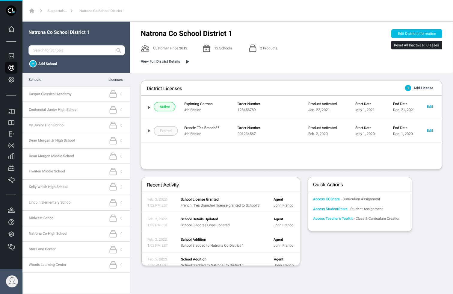
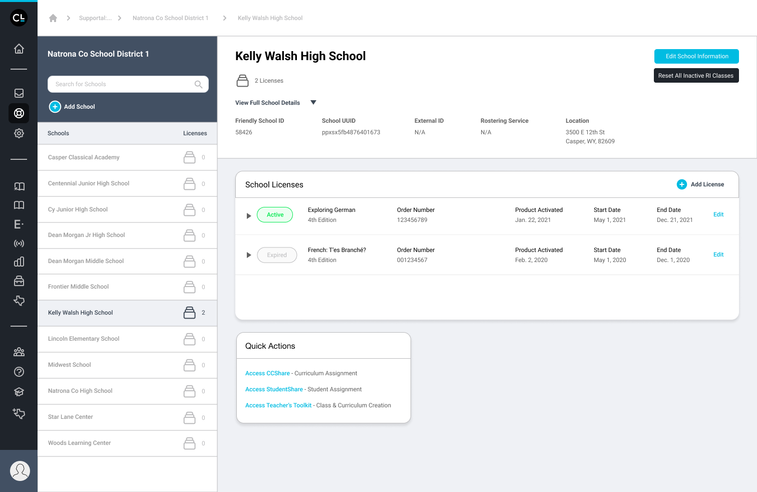
Education technology companies are ripe for data disparities as they often exist within complex ecosystems — databases, CRMs, servers, interactive learning tools, and roster integration providers. Like many education technology companies today, our client faced the challenge of sustaining their existing ecosystem while integrating new product lines into their platforms.
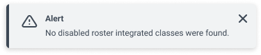
Alongside a UX researcher and designer in a team augmentation model, we helped our client team analyze internal systems, tools and workflows to identify bottlenecks in their processes. The primary bottlenecks we focused on were license activation and user onboarding to their platform — responsibilities of customer support agents. Customer support agents experience a “month of hell” every year during the back-to-school season as they face a littany of service tickets — teachers with missing roster integrated classes, students struggling to login, districts gaining access to products they never purchased. The more time that customer support agents spent on activating licenses, the less time they had for other customer issues and the worse the overall CX.
ROLE
Lead Product Designer
Activities & Deliverables
Data Maps & Gap Analysis
Ecosystem Maps
Customer Experience Journey Maps
Service Blueprints
Middleware Architecture Maps
Wireframes, High-fidelity Prototypes
Developer Feasibility Design Reviews
Handoff Documentation
System & Process Mapping
Maps tell us where we are and where we are going. They give insight to how information and actions flow throughout an experience. We delivered numerous types of system maps and led workshops with key stakeholders to fill in the blanks.


DEVELOPING TOGETHER
Establishing a relationship with the developers was a critical piece of this entire engagement as they were the ones actually bringing the design solutions to life. Early on, we set the expectation that the developers were to be intimately involved throughout the design process so they could bring up feasibility concerns, data limitations, APIs to leverage, and more.
We used Jira tickets to prioritize and collaborate on user stories and smaller user tasks, linking designs directly. We also provided in-depth documentation through associated Confluence pages for the entire organization to reference.
Testing, Testing 1 … 2… 3
Alongside the UX research and designer, I acted as the scribe throughout usability testing sessions and user interviews. Being able to hear first-hand what confused and delighted the users was key in understanding how they perceived and experienced the UI. From tenured customer support employees familiar with pre-existing workflows to seasonal employees new to the organization, we tested with primary stakeholders to ensure our proposed solutions not only met but anticipated their needs. Afterwards, we synthesized results and made design adjustments where necessary.
DESIGN
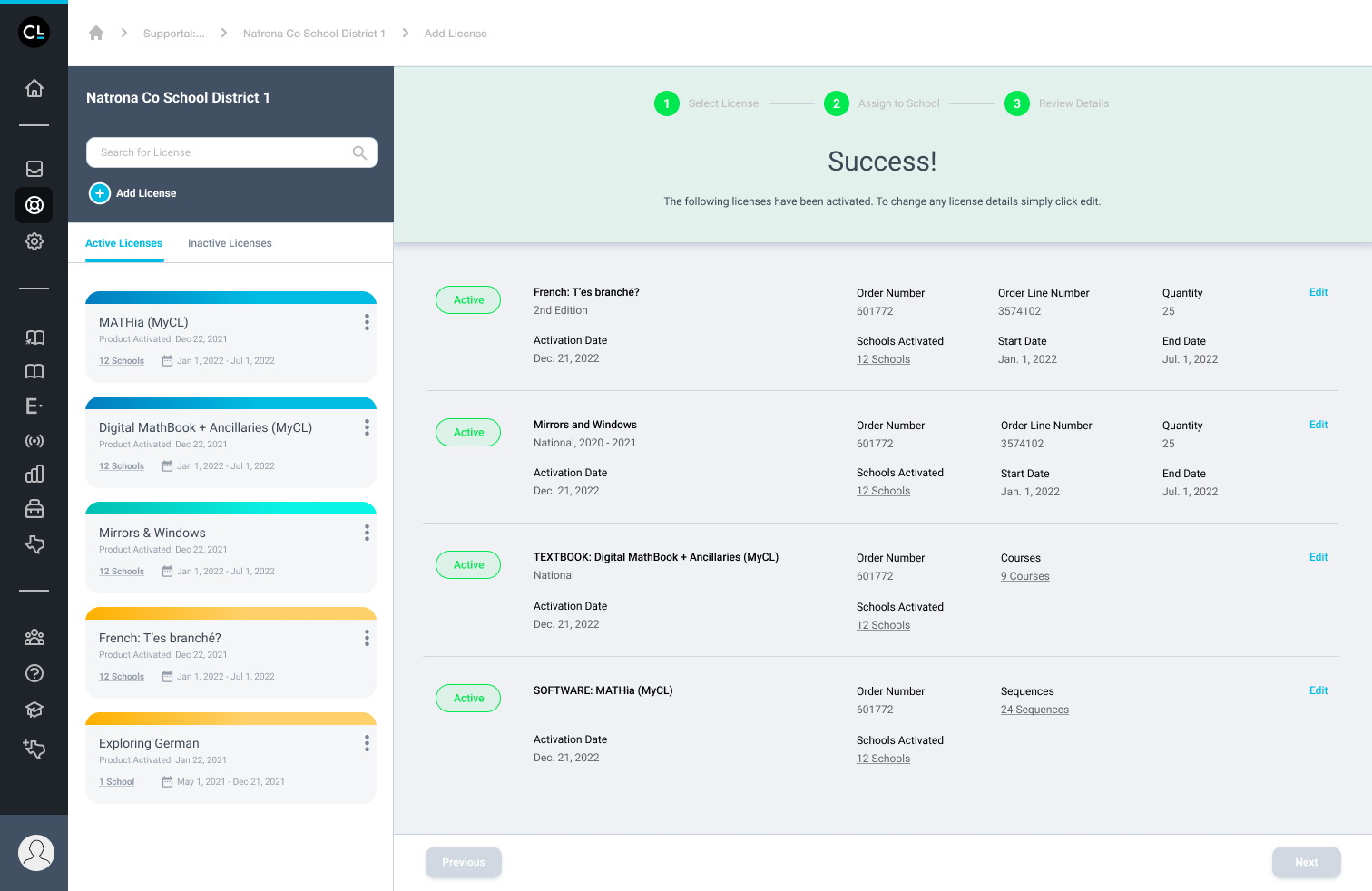
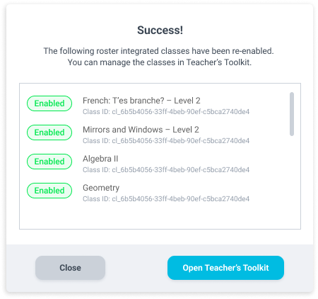
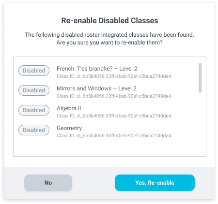
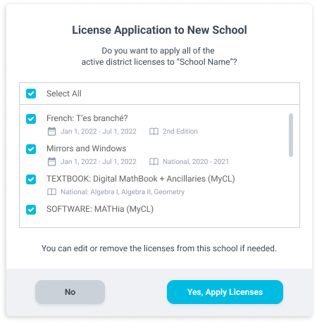
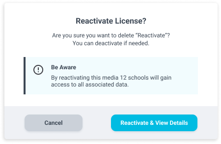
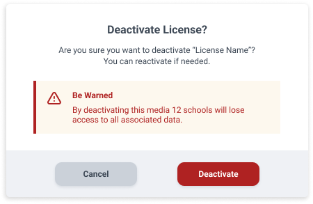
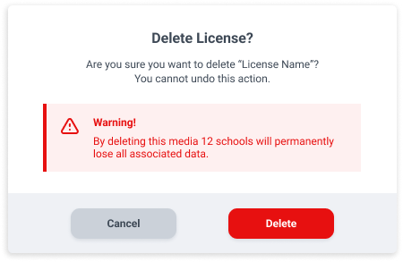
Arguably my favorite part of any project, the design phase of product design is filled with rapid iterations, napkin sketches of wires, brainstorming sessions for the small components to the larger experience. Every touchpoint and interaction must be carefully crafted with data driving it all. We created a guided activation process with three discrete steps for users to activate a license for a school or a district as a whole. We folded in the functionality of two licensing tools into one interface, decreasing the number of separate windows open for users and time to activate.


FORMER login experience for all platform users.

NEW login experience for all platform users.
HNI HEALTHCARE
Strengthening the corporate brand of a growing healthcare tech company — from visual to voice
HNI Healthcare designs intelligent processes and technology to empower talented people to transform healthcare. From its proprietary hospital medicine software, VitalsMD®, to its program management services, HNI Healthcare is leading the way in transforming healthcare.
Beginning as the Marketing Communications and Design Specialist, I was tasked with establishing the corporate brand guidelines, from visual identity to editorial tone. Out of those guidelines, I created a marketing materials catalog from which other departments could request items such as flyers, brochures, patient notecards and posters. I reported directly to the Director of Marketing and Communications to deliver digital presentations for RFPs and worked alongside the VP of Shared Services to launch the company’s first-ever GoogleAds campaign.
Soon thereafter, I was promoted to Marketing and Communications Manager. The Director of Marketing and Communications and I worked together to integrate Hubspot’s Marketing Hub into our workflows and ultimately our redesigned company website.
Learn more about HNI Healthcare here.
ROLE
Marketing and Communications Manager (Promoted Apr. 2021)
Marketing and Communications Design Specialist
SERVICES
Art Direction
Branding
Marketing Strategy
Recruitment Marketing
Web Design
Email Marketing + Design
Video Production
Editorial Design
Hubspot Integration
iCIMS Integration

Corporate Brand Guidelines
Spanning over 60 pages in length, the corporate brand guidelines act as a playbook for working within the brand of HNI Healthcare. I developed and designed these guidelines to incorporate the psychology of design. This aides employees in understanding the basis for the brand's visual identity or written tone.


MOTION + VIDEO
Moving with my favorite medium
I believe animation is such an important form of visual communication because it gives us permission to lean into our inner child and suspend our disbelief as we follow the story.
ROLE
Motion Graphic Designer
Video Producer
Videographer
Carnegie Learning Loading Animation

HNI Healthcare Videos
Texas Medical Association Videos
Miscellaneous Animations
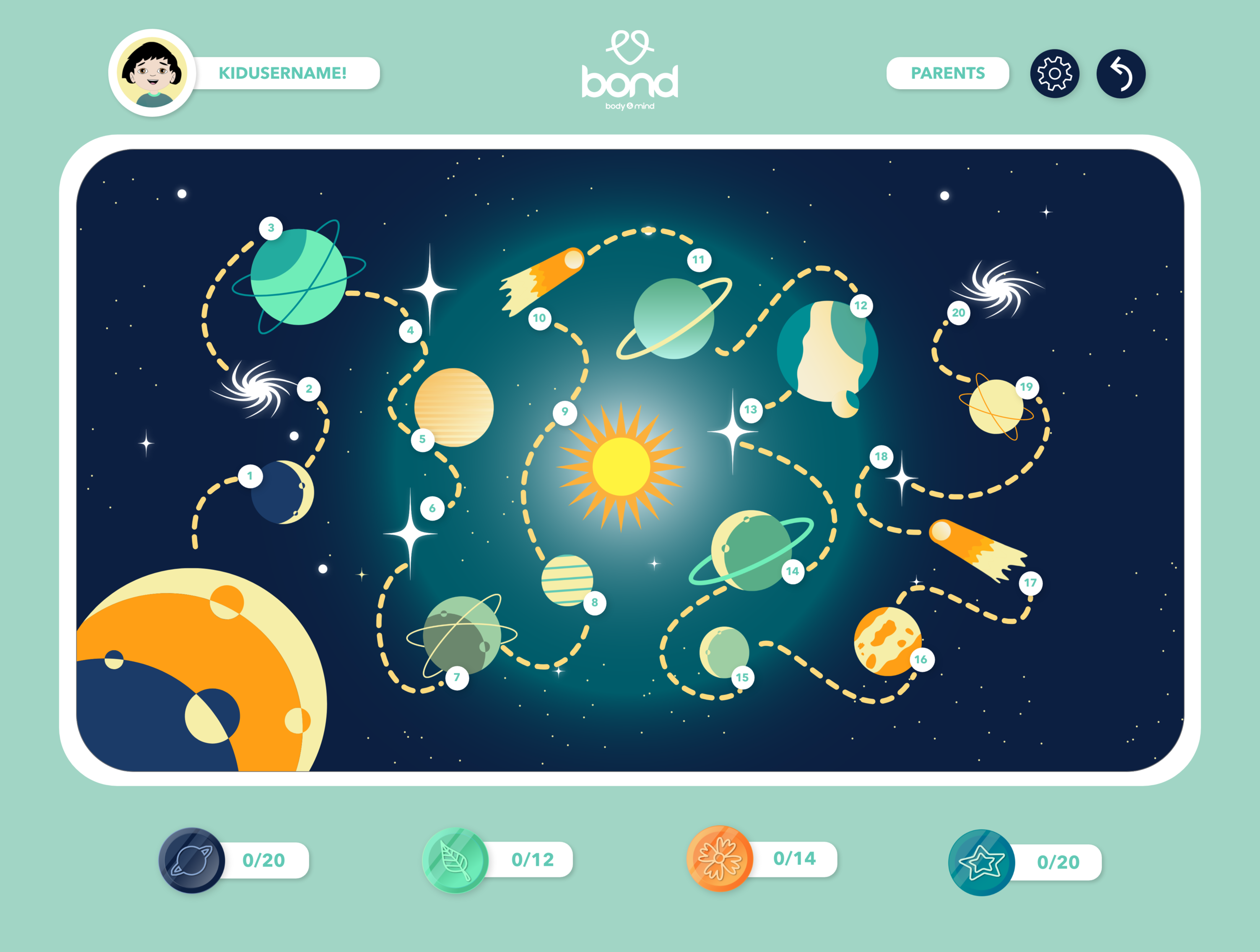
BOND (BODY & MIND TOGETHER)
Bringing to life the mission of an organization diversifying children’s education through physical and mental health skill-building
ROLE
Designer
SERVICES
Creative Direction
Product Design
UI/UX Research
Game Design
Web Design
Character Design
Illustration
Copywriting
Marketing Collateral
Educator Site


Parent Site


Kids Site


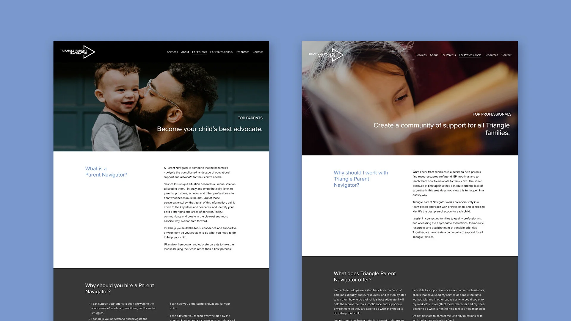
TRIANGLE PARENT NAVIGATOR
Leading Triangle Parent Navigator out of the past and into the future with a complete brand overhaul
Triangle Parent Navigator (TPN) is an organization that helps parents navigate the confusing maze of advocating for their child’s educational needs.
Established in 2008, TPN was and still is ahead of the latest policies and regulations of the educational system, however the visual brand was stuck in the past. I guided TPN through a discovery process to underscore why TPN exists, who it serves, and the possibilities that lie ahead for this organization. What developed was a professional, modern, and intimate identity that reflects Triangle Parent Navigator’s values.
To learn more about Triangle Parent Navigator, click here.
ROLE
Designer
SERVICES
Creative Direction
Branding
Logo Design
Visual Identity
Web Design
Copywriting


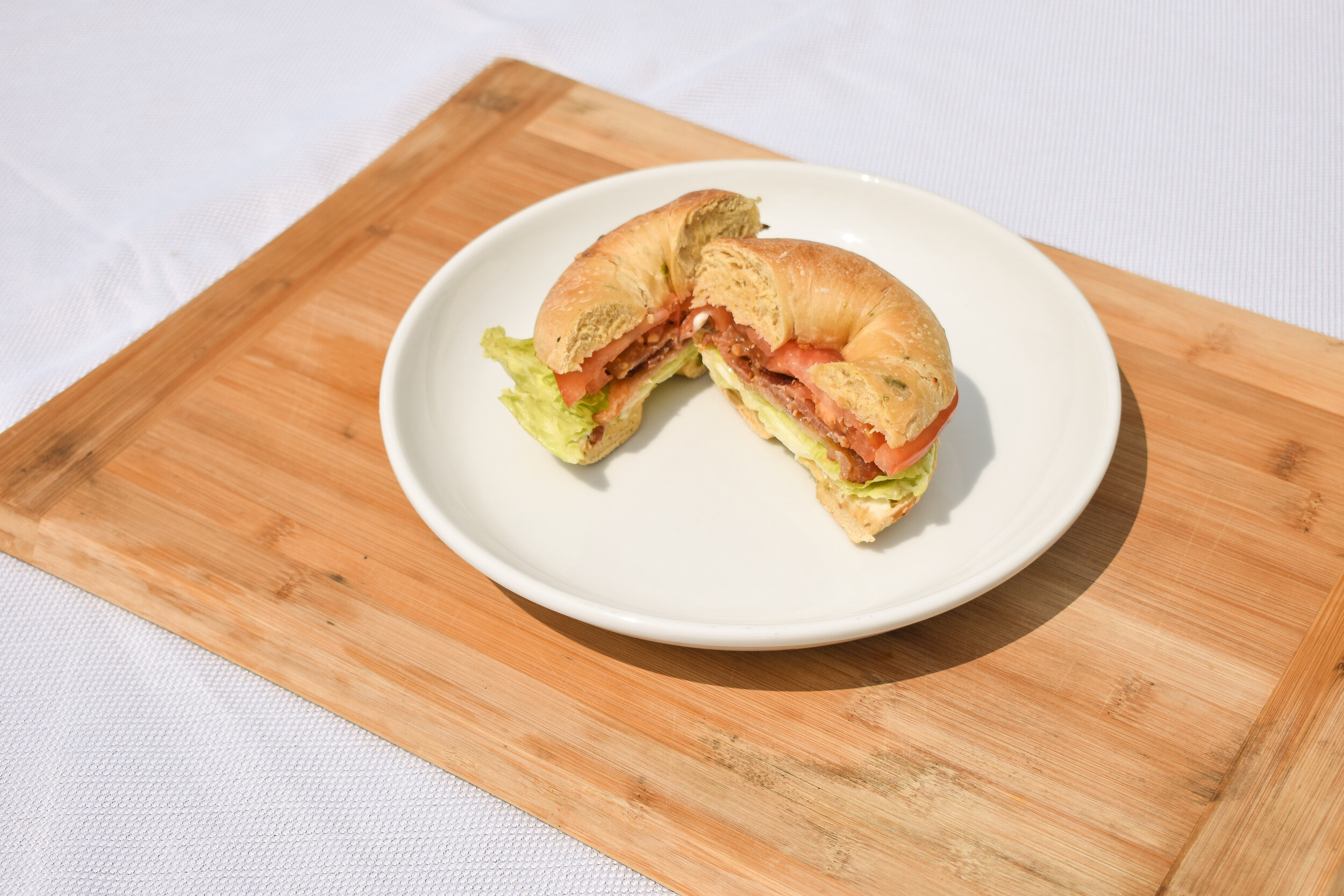
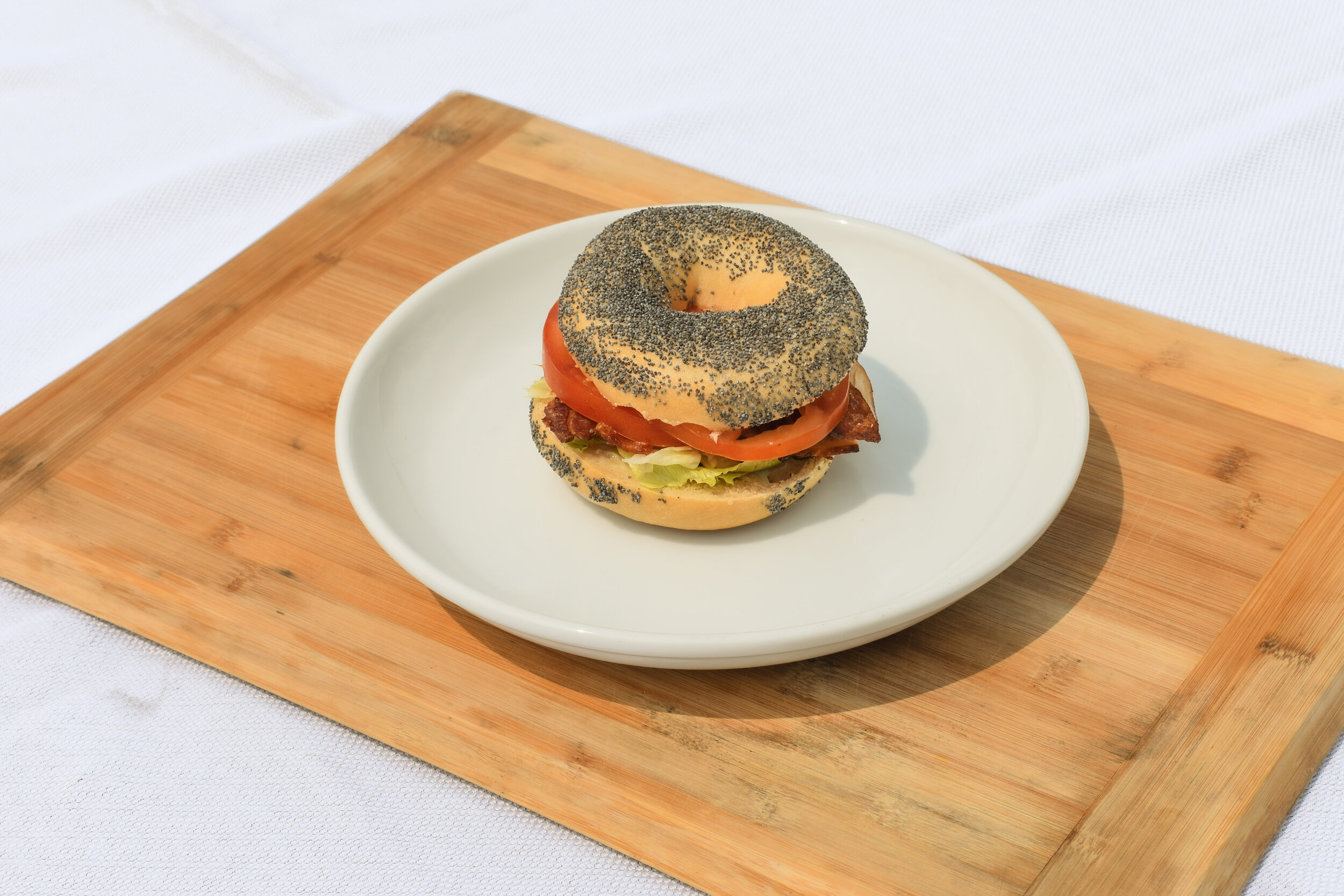
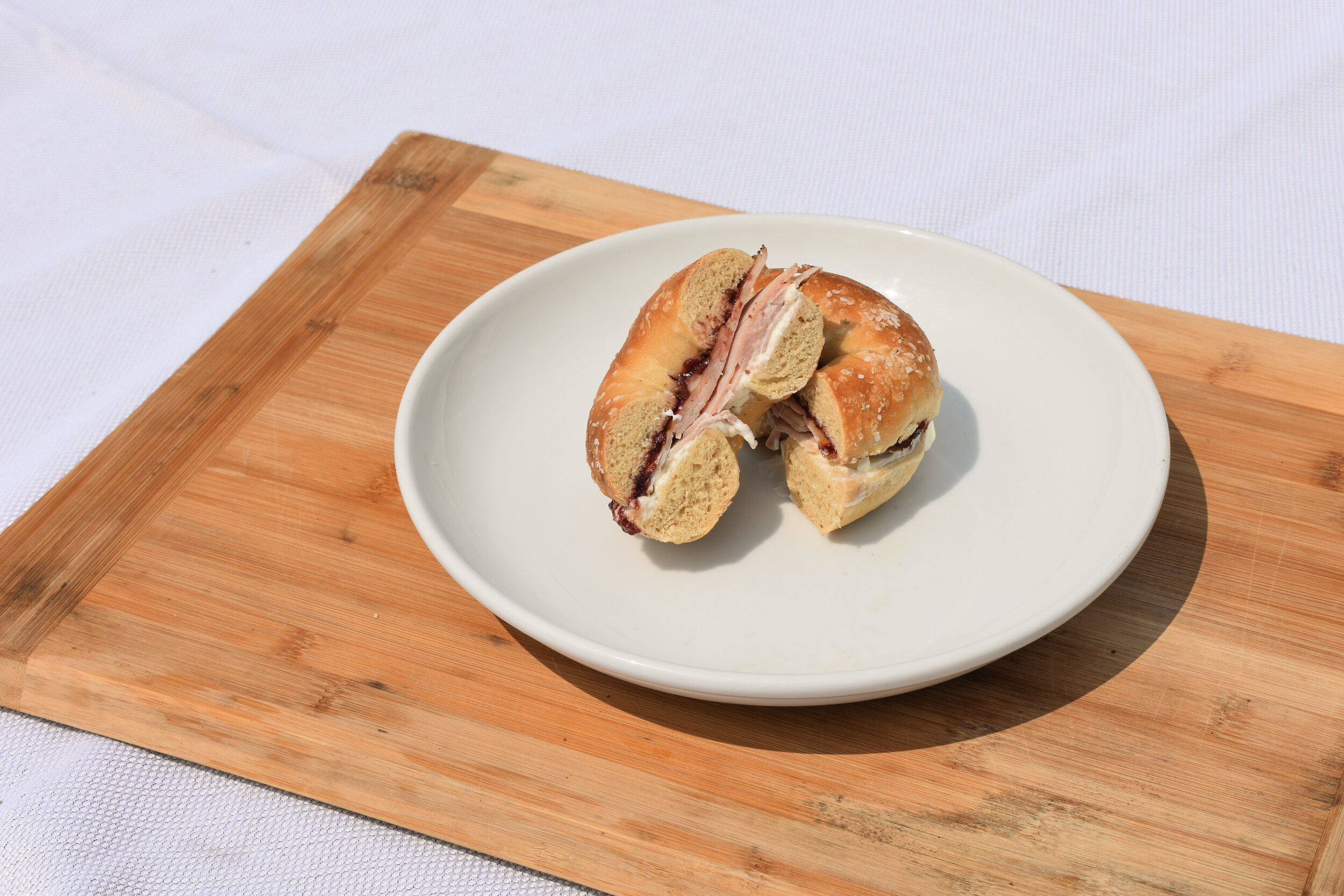
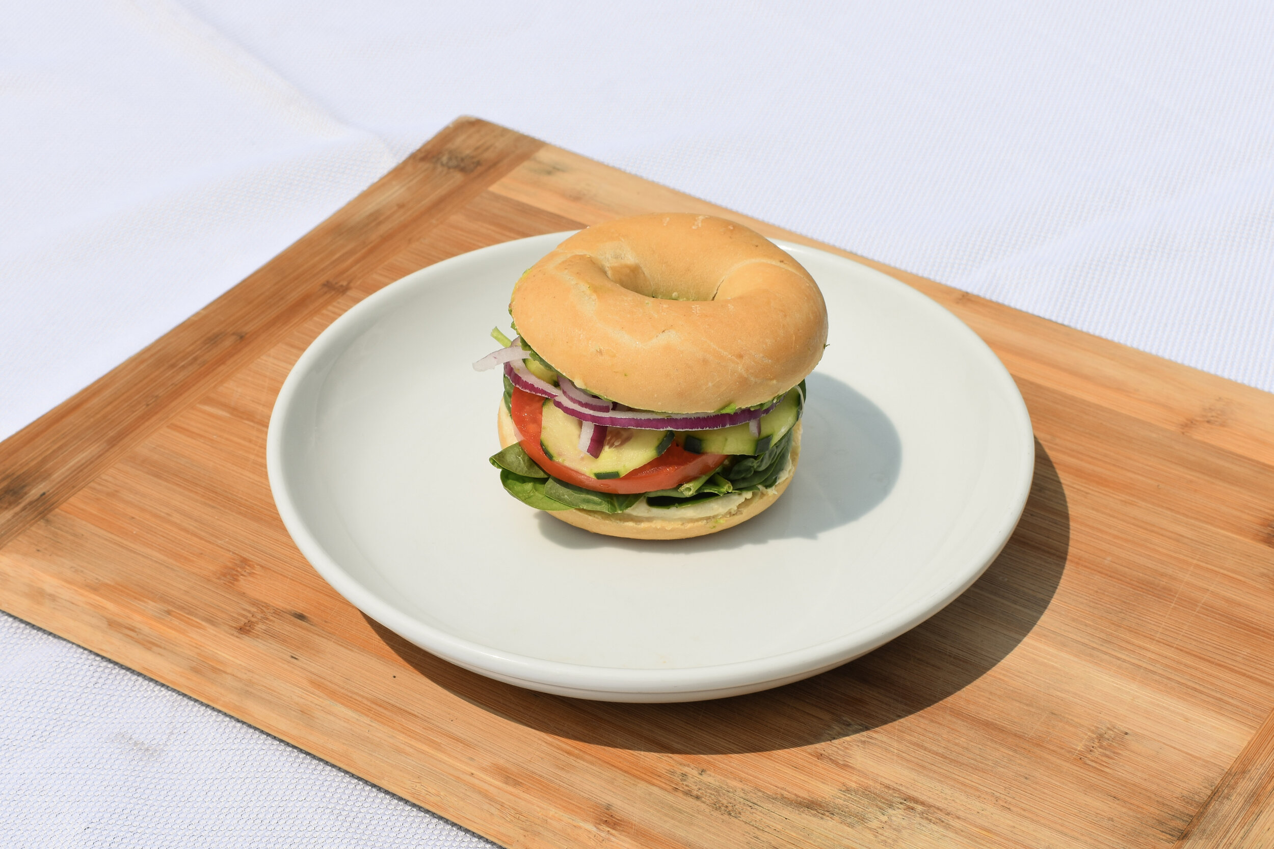
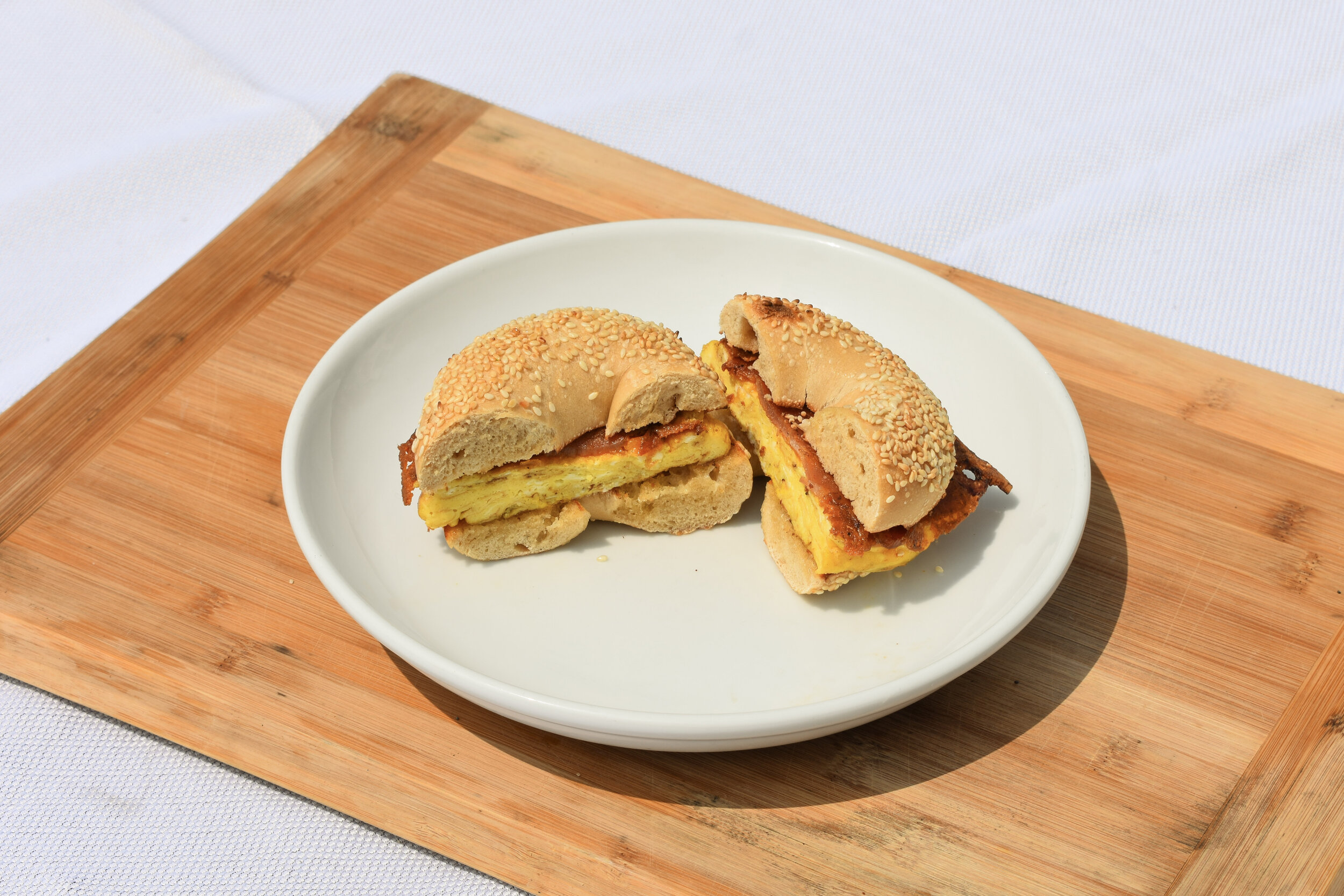
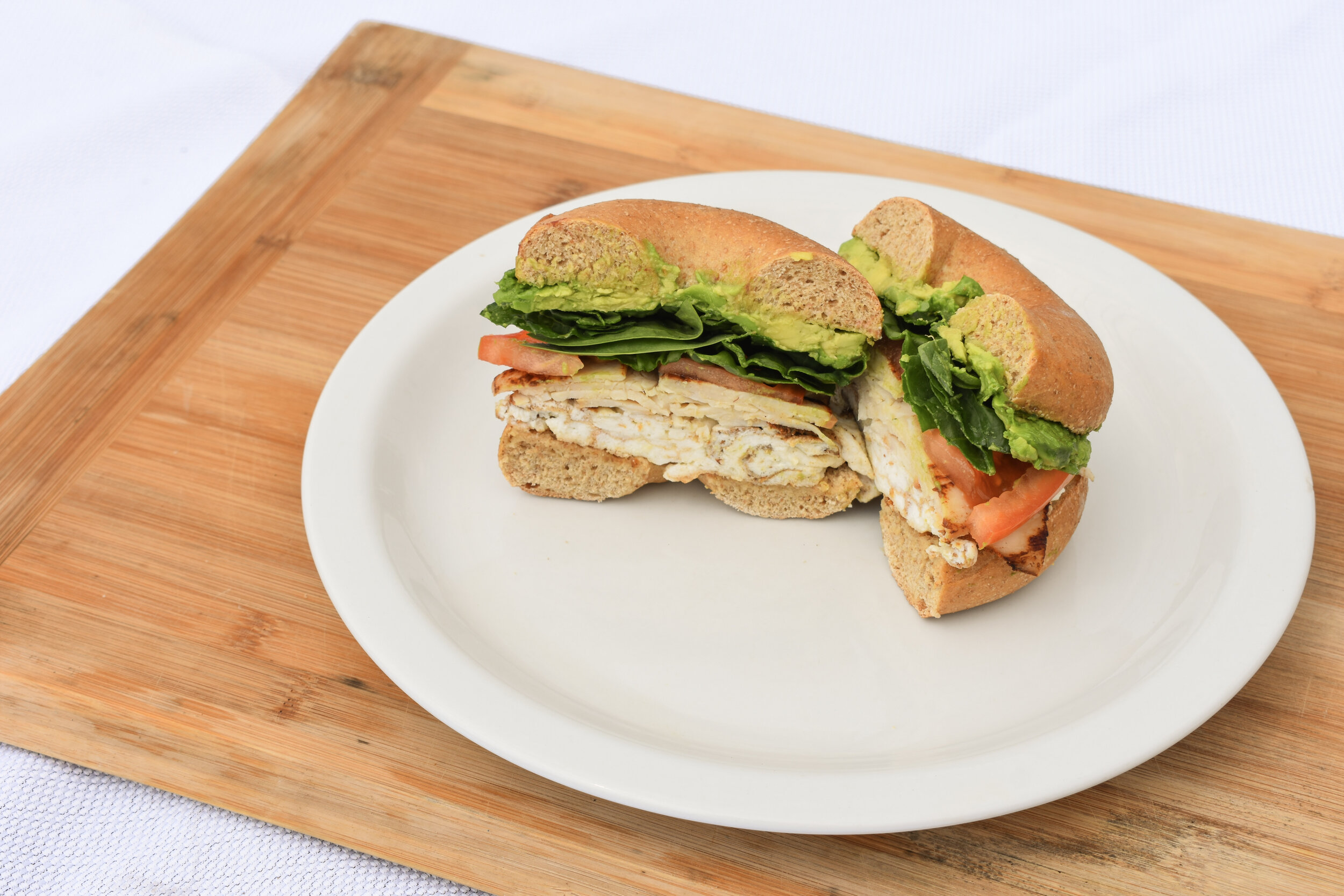
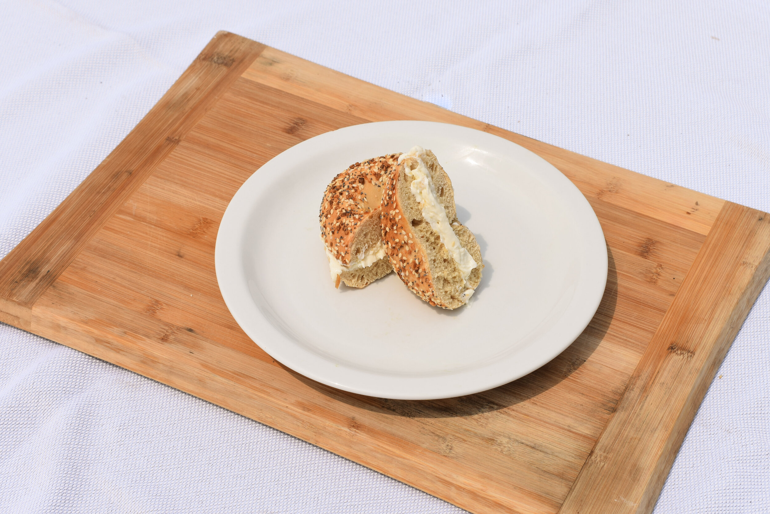
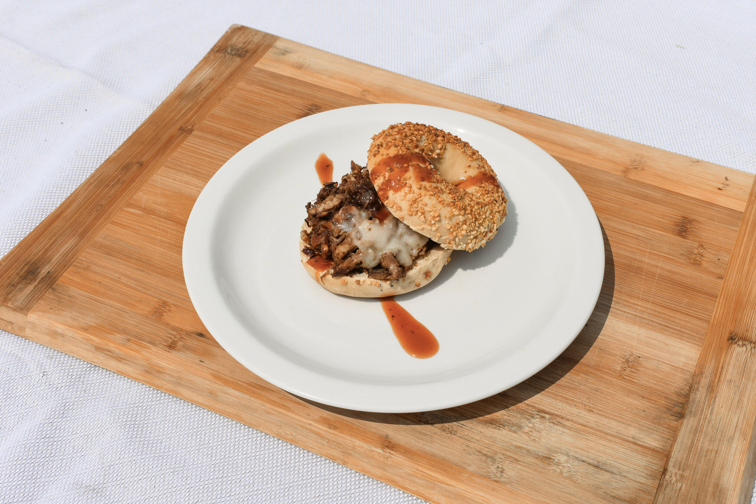
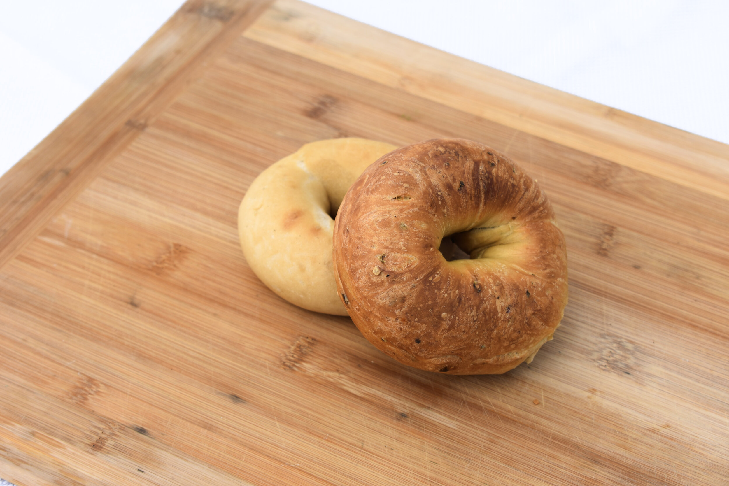
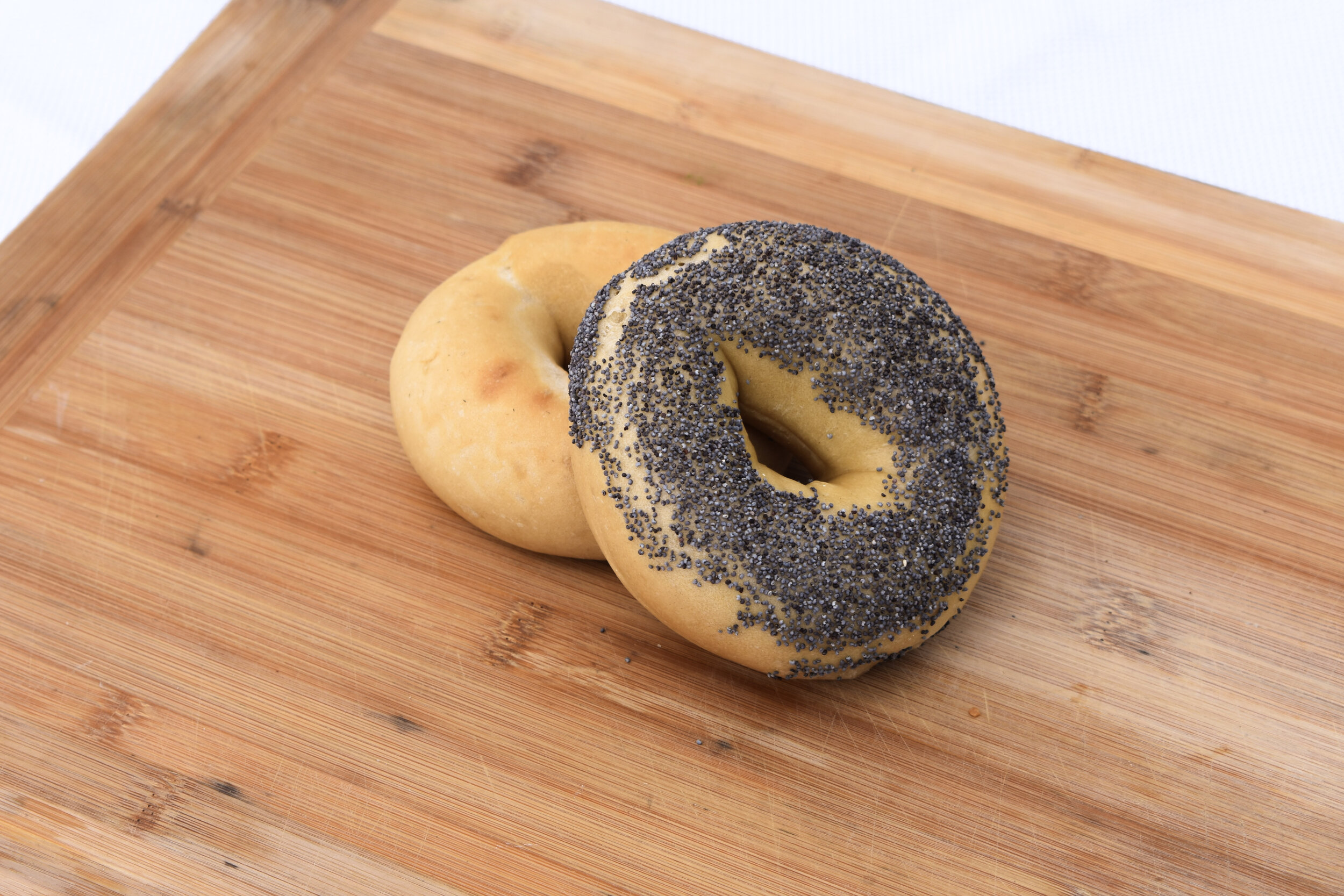
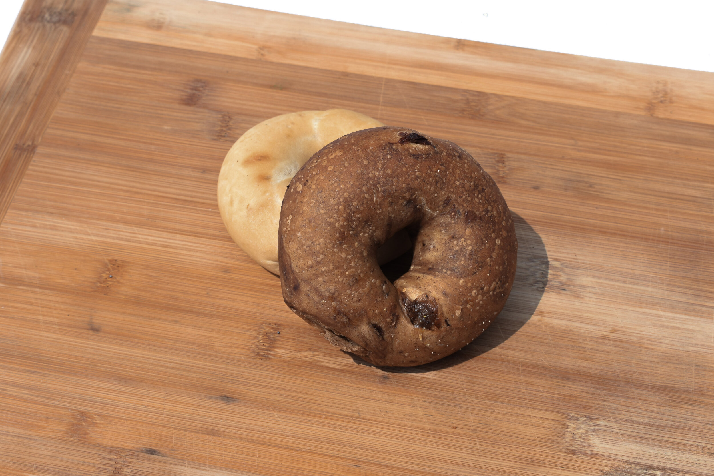
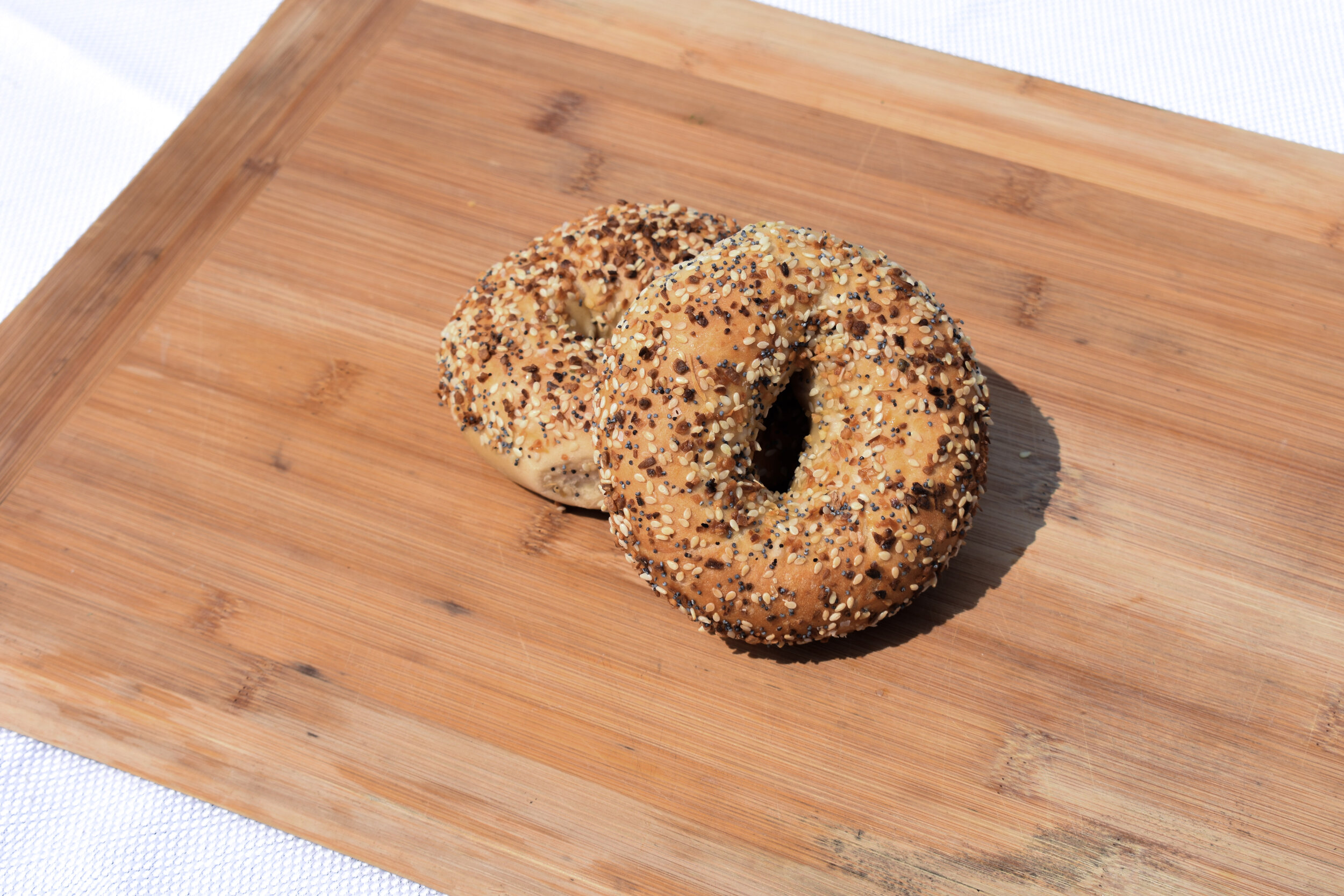
ROCKSTAR BAGELS
Baking bagels by day, making a site by night
While moonlighting as a baker at Rockstar Bagels, East Austin’s best bagel shop, I redesigned the website, establishing a unique brand voice and a mouth-watering visual experience.
Amidst the COVID-19 crisis, restaurants across the country and globe have had to quickly adapt to restricted ordering options for customers. I worked to rapidly integrate and deploy online ordering with Toast POS.
Check out Rockstar Bagels here. If you’re in the Austin-area, get yourself some of these damn fine bagels on the Eastside!
ROLE
Baker & Designer
SERVICES
Creative Direction
Product Design
Web Design
Online Ordering Integration
Copywriting
Social Media Collateral
Photography
Web Design


Social Media Graphics

Food Photography
FORT NEVER
Music to the eyes
Fort Never, an Austin-based trio, approached me to develop a site to promote their latest single “Trapped In Gold” and their forthcoming album. To honor the visual direction taken by their animated lyric video, I kept the color palette dark and moody with pops of gold and created a custom animation that greet users immediately. Users can also dive right into Fort Never’s music through the large play button that appears.
Check out Fort Never’s website here.
ROLE
Designer
SERVICES
Product Design
Creative Direction
Web Design

SIGNAL HILL
I spearheaded the rebranding of Signal Hill, a communications firm, updating its visual identity to reflect its bold mission.
Beginning as a digital storytelling specialist, I developed a strong foundation in content marketing and social media strategy, curating the voice and look of the brand.
As creative director I had the opportunity to take the brand in a new direction. I envisioned a bright and clean identity that celebrated the number one strength of this organization: story.
Learn more about Signal Hill here.
ROLE
Creative Director
SERVICES
Art Direction
Branding
Marketing Strategy
Web Design
Digital Content Collateral
Email Marketing + Design
Video Production
Editorial Design


THIS CONSCIOUSNESS
I hand drew a logo for a hands-on energy healer that encourages us to awaken our inner consciousness.
This Consciousness was founded to provide divinely channeled guidance from Spirit to help others awaken their intuition and begin their journey to their authentic self. I wanted to create a visual brand that honored the vulnerability, strength, wonder, and possibility that This Consciousness conjures.
ROLE
Designer
SERVICES
Creative Direction
Branding
Marketing Strategy
Digital Design

Photography by fortheloveofsmoke.info.
Mood Board
Curating a mood board for a project is always a delight as I can help pull images from the mind of my client and put them in front of them. Rooted in the belief of the Gaia’s innate power and feminine energy, this mood board pulled from psychedelia-inspired imagery of 1960s album artwork, spiritual symbology, and botanical illustration.

Sketches
My process is deeply intertwined with pen and paper. I always begin with sketches of concepts and then digitize them for client feedback. These initial logo marks were inspired by the client’s initial responses to my discovery questionnaire. I provide each and every client this questionnaire to help illuminate the brand they wish to embody and how that translates visually.

LOGO


PODCAST ARTWORK

TAROT CARDS

COMEDY IS PRETTY
Inspired by the founder herself, this mouthy brand is leaving nothing left unsaid.
Austin Leigh started Comedy Is Pretty to create a space for intersectional comedians to thrive. I wanted to celebrate the bold and bawdy voices of this feminist, inclusive, radical monthly comedy show and online community. What developed was a brand that is unabashedly authentic and pretty as hell.
Best Buds is series of Comedy Is Pretty that is for cannabis enthusiasts.
Learn more about Comedy Is Pretty here.
ROLE
Designer
SERVICES
Branding
Content Creation
Social Media Strategy


M. DELICIOSA
Plant-based education.
m. deliciosa was formed as an educational and community resource on plants. From the endocannabinoid system to policies that govern cannabis and hemp, m. deliciosa covers it all with unique designs. I began m. delciosa while in the Ph.D.-vetted Elevated Advocacy Program with Sativa Science Club as a way to share facts, debunk myths, and become a better advocate for cannabis.
Follow @m.deliciosa.designs to see more.
ROLE
Founder
SERVICES
Creative Direction
Branding
Marketing Strategy
Digital Content Collateral


THE PURPOSE OF A WILDFLOWER
This hand-drawn floral logo bloomed from the dreams of Lily Holden, the host of the podcast The Purpose of a Wildflower.
She invites listeners to join her and her guests as they explore self-love and true purpose as millennials and young professionals. Through an intimate discovery process, we revealed a passion for authenticity and softness. The calming colors and handwritten font combine together to honor the brave and gentle community this podcast created.
Listen to The Purpose of a Wildflower here.
ROLE
Designer
SERVICES
Creative Direction
Branding
Logo Design
Illustration
Visual Identity Guidelines


SPARKHAVEN THEATRE
I designed a visual identity that embodied this safe space for bright ideas.
Sparkhaven Theatre was established to support and raise up living voices through original new plays and works. In response to the homogeneous, heteronormative, white cis casts common to local theaters, Sparkhaven promises to responsibly employ and support artists that would often be overlooked.
I also designed the marketing materials for multiple shows from Nosferatu, The Vampyr to the anthology series Tales From Camp Strangewood.
ROLE
Designer
SERVICES
Creative Director
Branding
Logo Design
Visual Identity
Content Development


